Where i have this project already created in my head, i pretty much already know the scene locations that i'm looking to use. The reason i've chosen these specific scene locations, is because of the way how the practical lighting is set up, giving the footage the look that i'm aiming for, being that i'm going to be using a selection of fast lenses to help achieve this look within the chosen scene locations.
Front room
Front room/hallway
Set design for front room ideas, i want to try and have a similar set design,
Example of trashed front room
Bathroom
Set design idea for bathroom
Example of trashed bathroom
Basement
Meet location
Driving scene locations
Most of these still pictures were taken on my 50mm f1.8 filming at f1.8 48fps with 1600-2500 iso. The ones in the bathroom was taken on my 17-85mm f4-5.6 lens at f4 iso 1600, however i'm looking to film that scene using a 16-35mm f1.8 lens, and also use the same lens to get wide shots in the front room.
I’ve been doing some further research into style & Mise en scène to
grasp a better understanding of it, and I’ve came across a really good/valuable article on this website (http://filmschoolthrucommentaries.wordpress.com/2012/12/30/color-and-the-look-of-a-film-visual-analysis/) that has been very informative, and has opened my eyes a lot in regards
to visually analysing a films colour palette in regards to: the way how its
lit, framed and also designed so that it all looks visually in sync and easy on
the eyes, and also subconsciously plus emotionally connoting an idea about the
scene whether it be love, vengeance, or realism.
Because of my lecture on style & Mise en scène, this helped me a lot to further understand this article even more, and ensure me that i was researching into the correct information and not just random websites.
The opening paragraph pretty much grabbed my attention.
Color and the look of a film – Visual Analysis
Have you ever wondered or noticed why certain films look a certain way
tonally? It is not just a simple matter of colour grading an image in
post-production. A director works closely with a director of photography,
production designer and costume designers to create a colour palette that fits
the story of the film. The colour of the film is controlled on a set. Each story
itself can be told in a plethora of ways – meaning, depending on what that
story is about, and what is the thematic underpinning of it – the look of the
film will often be based on those factors. For instance it may depend on the
setting and the world within which the story takes place; time period, location
of it. Therefore the colour palette of the film will largely be dictated by
these elements. So let’s start looking at some examples..
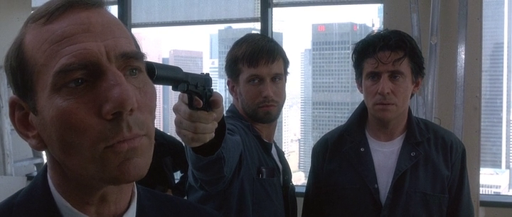
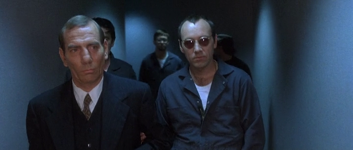
In a scene from The Usual Suspects below… look at this image, and try to
see why it’s visually appealing as well as, in a sense, homogeneous.
See it?
How about…
It’s pretty cold isn’t it? Now imagine if Spacey was wearing an orange suit — wait, how about if all of them wore t-shirts of different vibrant colours. The image wouldn’t look correct, because it wouldn’t match the background, the walls. This is carefully selected, so it’s visually “in sync” so to speak with the environment. If you take it a step further, why these suits were chosen also fit what the scene is about. If you can recall it, it’s an infiltration so they have to blend by acting like service people. The backgrounds are carefully chosen however so that visually everything you see is appealing to the eye, so you don’t question its validity.
Taken from http://filmschoolthrucommentaries.wordpress.com/2012/12/30/color-and-the-look-of-a-film-visual-analysis/
After reading this article, i looked over a few films and programs that i liked/discovered, to use as influence/ideas towards my projects colour palette.
Offenders
Director: Ron Scalpello
Writer: Paul Van Carter
What i like about this colour pallet is that the contrasty warm/vibrant red/orange colour tone in the intro for the film connotes the idea that the actor is angry, possibly lonely, and has a lot of hate in his heart. The warm, contrasty colour palette helps to convey this idea, and the fact that the actor is angry, and also also wearing black, beside the selection of clothing being common amongst london urban fashion, the colour of his clothing could also represent the hatred and anger within him. This films colour palette however, visually blends together nicely, and the selection of colours makes sense in regards to the scenes that they're in, and also set a mood for those scenes i.e. angry (contrasty red, black), action/fighting (contrasty red, black white), harmony/tranquil (saturate soft red, blue, yellow).
This was interesting research, the colour palette for Top boy was graded by a London based company called www.thelooklondon.com
In an interview taken from an article posted by quantel (http://www.quantel.com/repository/files/casestudies_The_Look_d11.pdf) , which was the hardware/software used to grade top boy, the owner and senior colourist Thomas Urbye said.
“Top Boy needs to attract a different audience
compared to the other dramas we’ve worked on. We have to
make it look ‘cool’ to appeal to a younger audience; therefore
we decided to make the grade even more dynamic. We chose
a highly saturated but carefully crafted look for the series; it’s a
style that young people are familiar with, like and relate to.”
"DP Chris Ross had worked colour in beautifully with his
lighting, but we had to take each exterior shot one at a time, and depending on the location and the feel of the scene, grade it
accordingly. This meant there was deliberately no consistency
with the colour palettes across the series; it completely
depended on the concept of the shot, the scene, and the
emotion it was purveying."
“In some scenes, especially those taken outdoors on the
housing estates, we had to create colour when sometimes it
wasn’t immediately obvious it was there, bringing out certain
colours so they stood out against the bleak background. Pablo’s
S-curve and keying tools gave me precision for tasks like this."
In an interview by the broadcast now show (http://www.broadcastnow.co.uk/techfacils/top-boy/5034428.article) Urbye says
“The note from the first camera tests was to be bold with colour and contrast, and never to show London as cold and desaturated, as it so often is in UK drama,” says Urbye.
“We even felt that the Hipstamatic app on the iPhone, which is so popular now, was a good reference. We loved the feel of reversal stock, but we could push it further, skewing hues and adding windows, which all meant this gripping story could also be told through its use of colour.”
Conclusion
This segment of research into style & Mise en scène has definitely opened up my mind, helping me visually analyse the colour palette and production design of a scene, and the connotations of what it could represent if done correctly. Hopefully this research should help me when choosing my scene locations and set design, plus costume design.
Even though i have an understanding of colour and what it could represent, i still have further researching to do so that i can explain exactly what it is that i see to other people, because if i'm working in a group, its no good me knowing what i want, and not being able to explain/express it to those whom i'm working with.
I've been looking at various intro templates online, and i came across one that i really like and feel fits the style of my production perfectly.
Im going to use the intro of this template for the 10 second intro gap i have at the start of my sequence, and i'll probably also use elements from it again for the outro, keeping the text and the animation from the keyframes; removing the background from the template, so that the text animates over the Ophelia picture as we get a wide shot near the end of the sequence.
First thing I done was
select the resolution and the length for the main part of the project, which
was 50 seconds (not including the intro) as my outro is going to be included at
the end of the main sequence
I then began to
produce the sequence according to the storyboard that I’d created, using the
camera tool to arrange my shots.
For my glitch
transition effect I used a plug-in called Twitch. How I achieved this was by
adding an adjustment layer over the current picture showing; having it overlap
onto the next picture, so that it would affect anything underneath it. I then
switched on the blur, light, and slide controls within the plug-in that
affected the picture like shown below. So that the picture being introduced
after the transition didn’t leave the frame; whilst this effect was happening,
I applied the CC Tiler effect so that it would mirror/extend the edge of the
picture.
Once I’d finished
arranging the first 35 seconds of the sequence; I then pre-composed it. With
the new pre-composed layer, I renamed it first flash back then duplicated the
layer; with the copy I then time remapped the comp making it 3.5 seconds long
from its original 35 seconds, I then reversed the layer. Using an adjustment
layer I repeated the same process using the Twitch plug-in.
This is what gave me
my flash back affect
Once I’d done this, I
then linked the composition over to adobe premier, which is the software im
going to use to add my sounds into.
This storyboard is a
guideline for me to stick to, when it comes to editing the sequence for the
sound design.
The reason I chosen
these specific shots; is because it helps to give the idea of my story. These
shots help tell my story visually before I’ve added in the sound.
The narrator/actor of
this would be the “spirit” of Ophelia, taking you on a journey through her last
moments alive, in a chilling experience as segments of the picture is revealed.
Supported by the sound we’re guided and signified as to what is happening with
what we’re seeing.
There’s various plot
devices focused on within the storyboard (flooded front room, pills, glass of
water ect), which, supported with sound will help to guide you through this
journey, gradually revealing the story.
This storyboard; together with my Picture sound analysis, is what i'm going to use to help construct my sound design project.
Brain stormed through a few idea and these are what i came up with
Out for revenge – Crime Drama
Charlie, a 25yr old
drug dealer, got robbed last night. Caught entering his
apartment after a night out celebrating new years eve, they beat him up, and
ransacked his apartment looking for cash and drugs. Out for revenge he contacts
his ‘connect’ to purchase a firearm and get his payback.
Bring back the Stash C*nt! - Crime Drama
Charlie, 27yr old top
member of his crime syndicate, one of his workers got robbed. The person whom
robbed his worker, his managed to find out whom it is and demands the gold bars
back. It is agreed so long as he pays some money as the job has been done and
the people did not know it belonged to Charlie. The briefcase is returned but in
a busy environment leaving Charlie unable to check it as there is police
nearby. When Charlie gets home and opens it he finds there is nothing there
with a note reading “jog on mate”
Homeless guy looking to get paid - Crime Drama
Robert, 32yr old
homeless guy, lives under empty shop doorway fed up with life, manages to make
enough money from begging to be able to buy a gun with hopes of using it to
make a profit by any means necessary.
Two different football firms’ bosses meet to
exchange - Crime Drama
Terry who is one of
the bosses of the Gillingham FC football firm also sells coke for a living; one
of his customers Blake is the head of his rival football team Dover FC. Angry 24/7, the only time Charlie is
happy is if his fighting, making money or getting laid. After beating his
rivals recently in football firm riot, delusional, he goes to do business with
his rival again. Confidant that business would go smooth, not realising that
Blake has gotten a new connect and has other plans for him, Blake gives Terry
counterfeit money and snidely mocks him in the process. Terry finds out when he
gets back indoors when he opens the bag to count the money and flips out.
Clumsy angry office guy – Comedy drama
Charles, a 25yr old
computer programmer; has ordered a computer hardware part off of Amazon. Due to
the bad delivery service, he has to go and collect his parcel from the delivery
depot. Once he returns home and opens the package he notices it is not the
correct item he ordered and morphs out (gets really pissed off)
Angry Rasta man who orders sandwich but turns
out to be pork – Comedy drama
Leeroy, 25yr old angry
Rasta man gets his daily morning sandwich from a café, they phone him early in
the morning to let him know his sandwich is ready, so that he can collect it
and eat it at his house before he leaves for work. Recently, due to new
management they messed up his order on their first day dealing with him. Leeroy
woke up like normal in the morning and collected his sandwich, and when he
returned home and opened up the sandwich; he notices it’s a pork sandwich.
Crack head out for a fix and gets sold polo
mints – Comedy drama
Roger, a 23yr old
angry crack fiend, is up early to get his fix of crack from a new dealer he met
the night before. He meets the dealer and thinks his getting a deal for crack,
when he gets home and opens up the wraps he realises it’s polo mints and not
crack!
The idea i'm going to go ahead with is the first one "Out for revenge – Crime Drama"
For today’s workshop,
we were set a practical directors task. Working in groups of three, the task
was to be a director and produce our own version of one of the following
scenarios:
1) To sit down on a chair and look at your watch
2) To write something down on a piece of paper, then screw it up and throw
it into the bin.
3) Trip over with books in your hand and the books have to slide across
the floor.
The two people I worked
with were Chris Sarmiento and Ruby Rogers. We each took it in turns either
being an actor or a camera operator for our project task, which we had to be
the director of for one of the scenarios.
For Chris’s project he
choose scenario 2. Ruby was the
Actor and I was the camera operator.
Feedback
Had fun doing this, the story was
a good concept and set design helped convey this, we even managed to
do a cheeky live action FX where we tricked the audience into thinking ruby got
the paper ball in the bin without looking. We achieved this by making ruby
throw the paper ball as hard as she could in the direction of the bin, while
Chris: standing behind me, at the same time the first paper ball went off
screen, dropped another paper ball into the bin making it look like an intended
shot.
For Ruby’s project she
choose scenario 3. Chris was the
camera operator and I was the actor.
Feedback
Had fun being an actor
in Ruby’s project, where I haven’t done acting in yeaaaars, also, to top it off
I had to be a stunt man lol.Count
myself lucky that I remembered how to break fall. The story was good concept
and easy to follow once organised, allowing Ruby to also feature in her project
as the person whom opened the door. To get the books so slide precisely, Chris
filmed another take with me sitting up, then roll/break falling onto the ground
being weak with the momentum I drop the books, which made all of them fall
within frame.
For my project I
choose scenario 1. Chris was the
actor and Ruby was the camera operator.
Feedback
Had fun doing my own
project, was kind of rushed for time but managed to come up with a decent
simple concept. I had Chris instead of sitting down and looking at his watch,
take a small journey through the studio corridor/lift to outside the television
studio and make a phone call speaking in Spanish, then look at his watch whilst
waiting around. Ruby was following Chris walking behind him keeping the camera
steady, which was a tough task for her as the camera is really heavy but she
done it considerably well. If I was to re do this again I would have the frame
keep a more consistent flowing tracking shot of the actor, clean the lens as
well where there was specs of dust on it, and also view back the camera footage
to make sure the exposure on the shots are consistent as some of my shots were
under exposed and over exposed.