I’ve been doing some further research into style & Mise en scène to
grasp a better understanding of it, and I’ve came across a really good/valuable article on this website (http://filmschoolthrucommentaries.wordpress.com/2012/12/30/color-and-the-look-of-a-film-visual-analysis/) that has been very informative, and has opened my eyes a lot in regards
to visually analysing a films colour palette in regards to: the way how its
lit, framed and also designed so that it all looks visually in sync and easy on
the eyes, and also subconsciously plus emotionally connoting an idea about the
scene whether it be love, vengeance, or realism.
Because of my lecture on style & Mise en scène, this helped me a lot to further understand this article even more, and ensure me that i was researching into the correct information and not just random websites.
The opening paragraph pretty much grabbed my attention.
Color and the look of a film – Visual Analysis
Have you ever wondered or noticed why certain films look a certain way
tonally? It is not just a simple matter of colour grading an image in
post-production. A director works closely with a director of photography,
production designer and costume designers to create a colour palette that fits
the story of the film. The colour of the film is controlled on a set. Each story
itself can be told in a plethora of ways – meaning, depending on what that
story is about, and what is the thematic underpinning of it – the look of the
film will often be based on those factors. For instance it may depend on the
setting and the world within which the story takes place; time period, location
of it. Therefore the colour palette of the film will largely be dictated by
these elements. So let’s start looking at some examples..
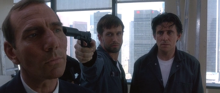
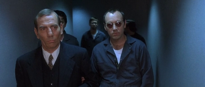
In a scene from The Usual Suspects below… look at this image, and try to
see why it’s visually appealing as well as, in a sense, homogeneous.
See it?
How about…
It’s pretty cold isn’t it? Now imagine if Spacey was wearing an orange suit — wait, how about if all of them wore t-shirts of different vibrant colours. The image wouldn’t look correct, because it wouldn’t match the background, the walls. This is carefully selected, so it’s visually “in sync” so to speak with the environment. If you take it a step further, why these suits were chosen also fit what the scene is about. If you can recall it, it’s an infiltration so they have to blend by acting like service people. The backgrounds are carefully chosen however so that visually everything you see is appealing to the eye, so you don’t question its validity.
Taken from http://filmschoolthrucommentaries.wordpress.com/2012/12/30/color-and-the-look-of-a-film-visual-analysis/
After reading this article, i looked over a few films and programs that i liked/discovered, to use as influence/ideas towards my projects colour palette.
Offenders
Director: Ron Scalpello
Writer: Paul Van Carter
What i like about this colour pallet is that the contrasty warm/vibrant red/orange colour tone in the intro for the film connotes the idea that the actor is angry, possibly lonely, and has a lot of hate in his heart. The warm, contrasty colour palette helps to convey this idea, and the fact that the actor is angry, and also also wearing black, beside the selection of clothing being common amongst london urban fashion, the colour of his clothing could also represent the hatred and anger within him. This films colour palette however, visually blends together nicely, and the selection of colours makes sense in regards to the scenes that they're in, and also set a mood for those scenes i.e. angry (contrasty red, black), action/fighting (contrasty red, black white), harmony/tranquil (saturate soft red, blue, yellow).
This was interesting research, the colour palette for Top boy was graded by a London based company called www.thelooklondon.com
In an interview taken from an article posted by quantel (http://www.quantel.com/repository/files/casestudies_The_Look_d11.pdf) , which was the hardware/software used to grade top boy, the owner and senior colourist Thomas Urbye said.
“Top Boy needs to attract a different audience
compared to the other dramas we’ve worked on. We have to
make it look ‘cool’ to appeal to a younger audience; therefore
we decided to make the grade even more dynamic. We chose
a highly saturated but carefully crafted look for the series; it’s a
style that young people are familiar with, like and relate to.”
"DP Chris Ross had worked colour in beautifully with his
lighting, but we had to take each exterior shot one at a time, and depending on the location and the feel of the scene, grade it
accordingly. This meant there was deliberately no consistency
with the colour palettes across the series; it completely
depended on the concept of the shot, the scene, and the
emotion it was purveying."
“In some scenes, especially those taken outdoors on the
housing estates, we had to create colour when sometimes it
wasn’t immediately obvious it was there, bringing out certain
colours so they stood out against the bleak background. Pablo’s
S-curve and keying tools gave me precision for tasks like this."
In an interview by the broadcast now show (http://www.broadcastnow.co.uk/techfacils/top-boy/5034428.article) Urbye says
“The note from the first camera tests was to be bold with colour and contrast, and never to show London as cold and desaturated, as it so often is in UK drama,” says Urbye.
“We even felt that the Hipstamatic app on the iPhone, which is so popular now, was a good reference. We loved the feel of reversal stock, but we could push it further, skewing hues and adding windows, which all meant this gripping story could also be told through its use of colour.”
Conclusion
This segment of research into style & Mise en scène has definitely opened up my mind, helping me visually analyse the colour palette and production design of a scene, and the connotations of what it could represent if done correctly. Hopefully this research should help me when choosing my scene locations and set design, plus costume design.
Even though i have an understanding of colour and what it could represent, i still have further researching to do so that i can explain exactly what it is that i see to other people, because if i'm working in a group, its no good me knowing what i want, and not being able to explain/express it to those whom i'm working with.