Posted by : Unknown
Friday, 15 January 2016
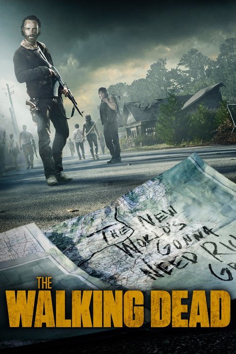
Following previous HBO shows, whenever they have a series that involved crime, action, horror, they normally have a title design that helps portray this idea across to its audience, combining the colour of the text and also the design to help invoke a certain idea into the audiences minds upon first glance.
Colour
In order to further convey the themes and genres featured within the series Gangsta, the colour of the Title will help to do this as they will be dark red and black, which signifies danger, fear, death, evil, power, desire and strength.
Title
In order to establish Gangsta's brand identity, the typeface that gangster will use will have a bold, clean but also gritty appeal that will insinuate an ominous nefarious impression, so that anyone who looks at the title straight away will be able to identify that the brand is connected with some form of vice activity. This will help to strengthen the notion about the series being a crime thriller action genre.
Here's Variations of title logo's that i created, using the font Impact bold as my starting point, then using a selection of textured paint brushes to fragment the individual letters, then re-layering the text using with various paint textures, finally, placing a blooed hand texture behind the text.
After experimenting with the text designs, this is what i came up with for my final design


large.jpg)


